Sometimes the best changes come from honest self-reflection. Looking at my website recently, I realized it had become everything I didn’t want it to be - flashy, distracting, and surprisingly low on substance.
This realization led me to completely redesign my personal site with a singular focus: strip away everything that doesn’t serve a clear purpose. I wanted to return to the core reason I built this site - sharing what I’m learning and building in a format that’s accessible to anyone.
Let me walk you through my thought process and what I learned along the way.
The Problem with My Old Site
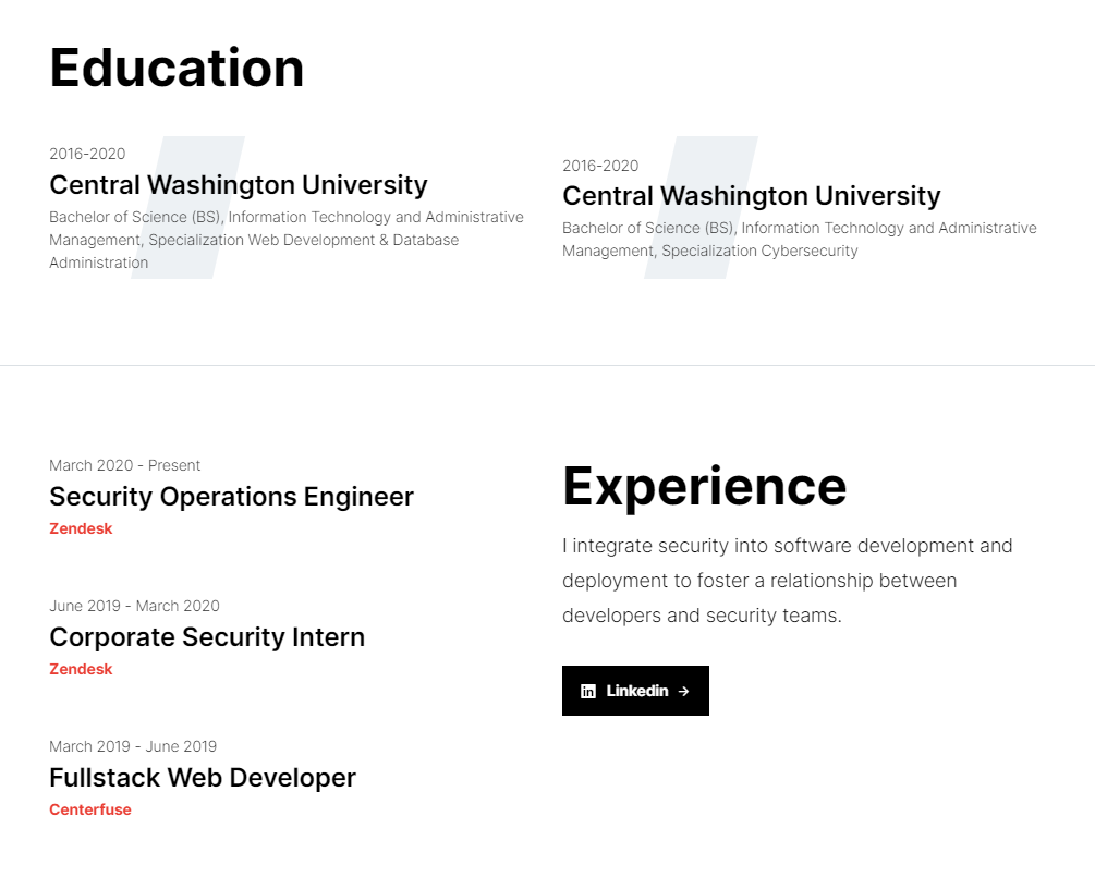
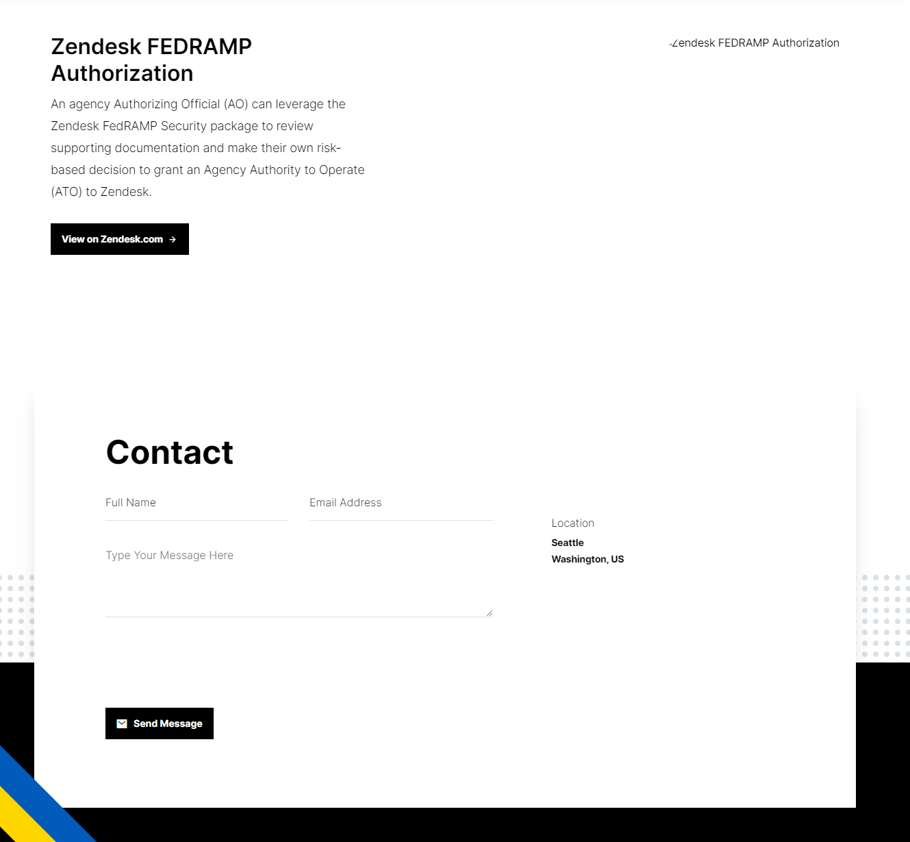
My previous design fell into a common trap. It was built for the sole intention of being a pretty portfolio, with a traditional layout showcasing my education, work history, and project highlights:


While this format works well for job hunting, it wasn’t aligned with my actual goal: creating a space for sharing ideas and documenting the things I’m learning.
Three Principles for the Redesign
I approached the refresh with three clear objectives:
- Create a dedicated space for notes and thoughts
- Design for readability first
- Make it effortless to maintain
1. A Home for Ideas
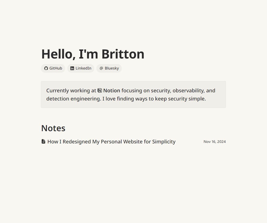
The new design centers around a simple notes section, replacing the resume-style layout with something more conducive to writing and sharing:


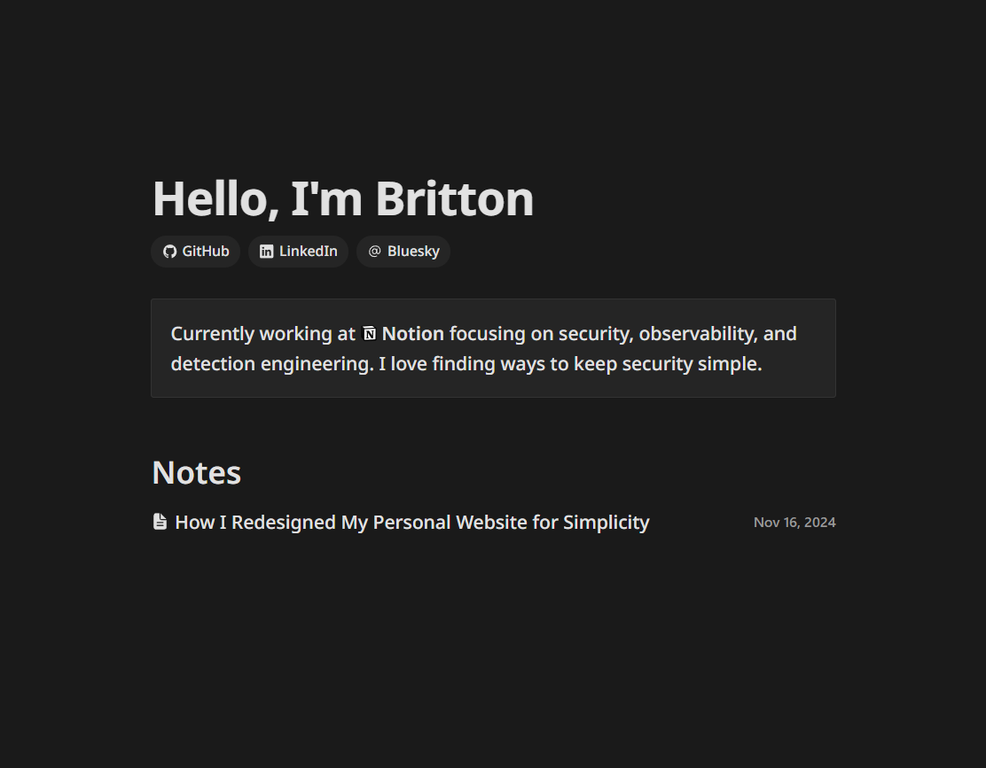
Also, I’ve added support for dark mode, which I’ve found to be a nice feature for reading on my phone.
2. Optimized for Reading
Taking inspiration from tools I love using - like Notion and Kindle - I focused on creating a comfortable reading experience. For the color palette, I used a color picker on photographs of Moleskine notebook pages under warm incandescent lighting. I’m not sure why I’ve never thought to do this before, but it felt like a good way to get a palette that was familiar and easy on the eyes. Rather than spend a lot of time tweaking colors, I just used the colors I liked from a physical object I had in front of me.
The design now features:
- Clean typography and generous whitespace
- A warm, paper-inspired color palette derived from actual notebook photos
- Carefully balanced contrast ratios
- A thoughtful dark mode that avoids harsh blacks
The goal was to make reading feel as natural as flipping through a familiar notebook.
3. Built for Maintainability
A site focused on writing needs to be easy to update. I chose Hugo as my foundation because it lets me:
- Write content in simple Markdown
- Deploy automatically to Netlify when I push to
main - Use the Frontmatter VSCode extension for a seamless writing experience
This setup means I can focus on writing rather than maintaining complex systems.
The Result: Less Really Is More
The final design is intentionally simple. You won’t find any fancy animations or complex layouts. Instead, you’ll find:
- Clear, readable content
- Improved navigation
- A warm, accessible color scheme
- A dark mode that’s easy on the eyes
While there’s nothing groundbreaking about this redesign, that’s exactly the point. By removing distractions and focusing on what matters - the content - I’ve created something that better serves its purpose.
I’m excited to use this simplified space to share more about what I’m learning and building. Sometimes the best design is the one you barely notice because it just works.